
Battle of Ages
A downloadable game for Windows, macOS, and Linux
About the game
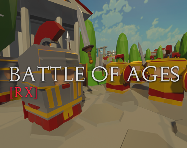
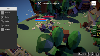
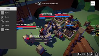
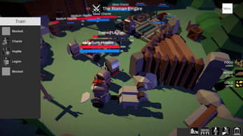
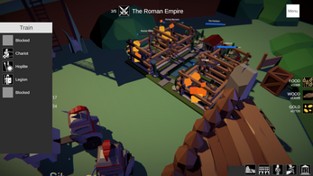
Battle of Ages Rx is a prototype-ish low-poly strategy game inspired by games like Age of War where the player must destroy the enemy's main base. To do so, both the player and AI train soldiers who will fight each other until reaching one side. In BoA Rx you train and upgrade units, to do that you need resources, you can get these from certain buildings (depending on the faction), and to get more, you must upgrade and research other stuff. Researching, training and upgrading, all require time, and buildings can only perform one of these actions at a time.
As of now, the Roman Empire is the only available faction, and it's also cut-in-half in terms of content (literally, despite having models for the Lv 3 buildings, I've completed only the first 2, the next thing to do would be to expand on this). After the Roman one, I'd like to introduce the Japanese (based somehow in Oda's Clan), a WW USA faction, and a WW2 German one too. BoA is not a game settled in a specific period of time, instead, it takes an approach more similar to what some Civ games do, by introducing multiple factions from multiple eras. These will all be played in a balanced way obviously, you can think of it as in "one legion of Romans, equals one military soldier alone" for example.
Current Features:
- Experimental Easy and Hard difficulty (Still, really basic AI just to test things out, it will train units and upgrade things on the go, easiest one takes more "time to think what to do")
- Unit & Building upgrading system: I love management and strategy games where you can upgrade things, and then see the results visually.
- Only one faction ("Roman Empire") and one testing level. Decided to not use terrain in Unity and just use my models instead to preserve a more low poly and modular-like approach. I'm considering changing this rather than expand on it hm
- Unique faction mechanics, looks, units/buildings and upgrades: Factions feature unique units each one, unique buildings, unique layout, unique types of resources and unique ways to progress. From many weak units training fast, to stronger and bigger ones, from a focus into long-range to one into close combat, from low population limit to large armies of multiple soldiers, from a faction with 3 buildings and 5 resources to one with 6 buildings and 2 resources. I want every faction to look and feel different.
Some of the planned Features:
- Multiplayer
- Localization (starting with Spanish, which is my main native language rather than English, which is the base language for the game btw)
- More factions (obviously)
- New mechanics, rebalanced and expanded old ones.
- More and new assets (from music to models and animations, cause despite the simplistic design, I still find it too plain).
- Different game modes, and a better AI (which is not difficult to do since the actual one is almost brainless)
- Polished and more optimized UI, maps, animations, code (yes, code must be optimized and polished asap).
There's an in-game tutorial already explaining what's the objective and what are the basic mechanics. There's no score currently (not even timer), there are no rewards, there are no unlockables. This is a prototype and I plan to expand and improve upon it.
Quick note: Expect bugs and balance issues, the game may feel too hard or maybe too easy, I evaluate any kind of feedback, and you're free to not only provide criticism but also to make suggestions. I'd highly appreciate it.
The game is and will always be free without any kind of paid content.
If you want to share your thoughts about the game with me, then feel free to DM me on Discord!
You can also comment about it down below.
| Status | In development |
| Platforms | Windows, macOS, Linux |
| Author | VNBP - Leo |
| Genre | Strategy |
| Made with | Unity, Blender |
| Tags | Arcade, Low-poly, Management, Medieval, Real time strategy, Short, Singleplayer, Unity, upgrades, War |
| Asset license | Creative Commons Attribution_NonCommercial v4.0 International |
| Average session | About a half-hour |
| Languages | English, Spanish; Latin America |
| Inputs | Keyboard, Mouse |
| Links | YouTube, Twitter/X |
Download
Install instructions
- Download and extract the .rar file containing everything.
- Execute 'Battle of Ages Rx.exe'
*Note: The game should run on windowed mode by default, but you can always change it from the settings menu.

Comments
Log in with itch.io to leave a comment.
Hey, friend! I played the Alpha 21.7.7 version. It's nice to see the progress of your game! Really love the Japanese map, it's very pretty. I'll focus on that for now: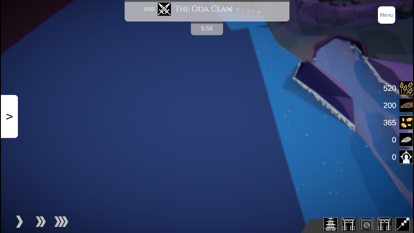

- I think the map is too big. I played using the Oda Clan against the Roman Empire. Had to give up defeating the other team after half an hour passed. The units walked too slowly, so when one dies, they aren't able to keep up the progress they've made.
- Add more boosts/upgrades for the Oda Clan. My resources started to pile up. So I feel like adding more upgrades for the amount of units on screen and speed boosts would do some good.
- Enemy base was hard to focus on since the camera was too close to it's edges.
- Camera went inside the map. I could see through it (saw the river) when I tried to move right from my base.
Other comments:
- Maybe add an option on how to make the camera move by mouse drag. I found it a bit hard to control the camera, but it might just be me.
- When starting a new game, there's a stray <\B> for the Oda Clan's description.
- When in game, pausing it, then trying to open settings, the screens pile up on each other.
Really proud to see the progress you've made, friend! Keep it up!
Hey, I will add my general feedback as I play, so here (edit after playing: the game is good, this are just some general QoL problems I found):
- You probably should change the scrolling speed for the resolution settings, it's awfully slow
- The same goes for what I guess is called 'alpha notes', but I am not sure because the spanish translation seems a bit weird. Basically the patch notes.
- Nevermind, every scroll has that problem.
- In the 'tool upgrade' panel in the spanish version, one of the <color=numbers> is visible
- I played with the Oda clan, and idk if I am dumb or something, but my units felt a bit underpowered(one hoplite decimated an archer and a lancer)
- I would appreciate a slider showing the progress of an upgrade in the UI (instead of just having it in the 3d model) since I first struggled to notice the one in the map
As I said in the edit, the game is good and it has lots of room for growing and potential, those are just some little nuances that would make the experience better overall imo
Thanks for the feedback friend, really appreciated it!
I'll try to address these problems asap, the scrolling speed is the default one (the one every scroll-able panel has by default in Unity), so sure I'll change it so one can properly scroll things down/up rather than drag and drop.
Regarding the alpha notes section (notas de alpha, or notas de alfa, or notas de version temprana de pruebas in Spanish) is not one pointing up updates nor any type of changelog but actually just a note regarding the overall alpha status of the game, most of the text, the entire thing actually, is just static text left there in case someone who liked the game enough, and with too much free time, wanna read it, I'll later change it into a short one page one, and will also change the static tutorial for an interactive mini-match.
I'll look into the <color> one for sure, according to what you said, I understand you found it in the description (inside the panel showed after hovering over an upgrade called something like "tool upgrade"), is that correct? Just so I can easily locate the issue.
The Oda clan features a different kind of gameplay, early on units are weaker for sure compared to Roman ones, but the spearmen are faster to move and train. I'll still look into balancing them more. And will also look into showing a progress bar within the actual main UI rather than only over the 3D model.
As said before, feel free to point up any other issue you found, suggestions of any kind are welcome too, and same goes to the Spanish version (if you found it wrong or less natural for example, and know about cool changes to make it better, feel free to tell me, same goes for English too).
Thanks again friend!
Regarding the balancing, don't take me too seriously since I am still trying to get the gist of the game.
About the color one, I think it is where you mentioned, though I don't remember exactly.
I will definetly try it again later to see if I have any more meaningful feedback.