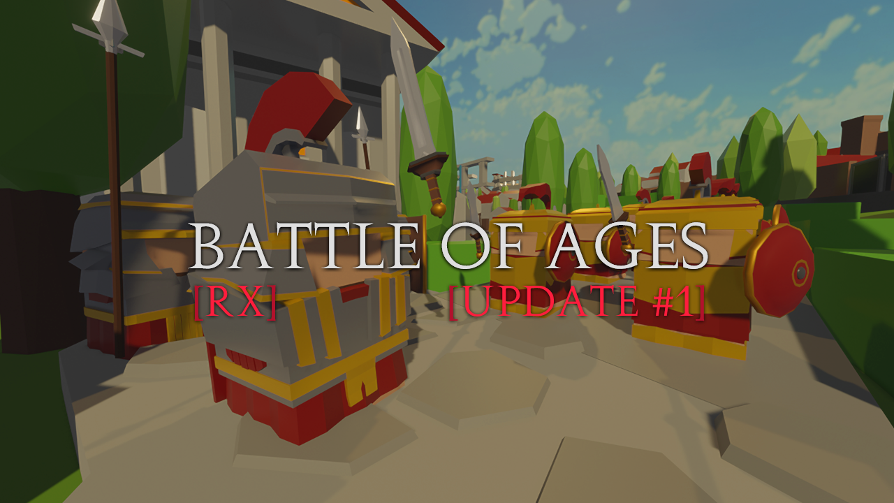
Update 1 - Tweened UI, Scoreboard and more!
I've been working from time to time this last week on fixing some bugs, improving some things, and introducing some new stuff. Generally speaking, the biggest changes are the Tweened UI (Animated one), some new options in the tutorial and options menu, some new scoring system based on certain aspects (wip as hell), tweaks everywhere, the ability to see more data related to upgrades, stats, and resources, and the Linux and Mac builds.
Some friends told me "there's no way for me to know what an upgrade really does" or "did you noticed that there's no way for the player to see or know about the basic unit's stats?". So I tried to fix some of the known existing bugs, while also adding new elements to the existing UI and making the new ones too.
I've also learned how to use DOTween in order to animate stuff from code (which I think should be faster than via Animations). You may notice some weird behaviors from time to time (better if you don't), in such case feel free to reach me out so I can appoint it into my stuff to fix later, so I can, well, try to fix it later..

Completed list of changes:
- New shortcut: You can now use 1-6 (Numpad keys) to open each building's panel.
- New shortcut: Zoom in/out hotkeys added.
- Gameplay: Every unit got rebalanced, especially the Legion. Same with buildings upgrades and gathering.
- Gameplay: Changed some small aspects of the AI (still stupid af), it's also easier to beat. (I'll work again later on this)
- Gameplay: Scoring based on time, units created, units killed, and units lost.
- Gameplay: Unit stats now pop-up from the Train panel. Allowing you to know how powerful each unit is.
- Gameplay: Optional drag-styled camera movement added (a pretty weird one, it's pretty hard to implement correctly due to the way I handle the camera in-game, still, this is totally optional).
- Gameplay: Units can now be interrupted while attacking a building (they won't just let you punch them without caring)
- Design: The 'allow' toggle should be way easier to understand now. Whenever a unit is holding on there, it will bounce so you can see.
- Design: Camp node UI now hides when the player is far from it.
- Design: A blue-ish circle around your units and the enemy's obvious red name should now make it easier to know which one is yours and which one is not.
- Design: Base Zoom-out increased.
- Design: Main UI elements animated, along with every other panel. This should make things prettier to control and look at.
- Design: One can now see what upgrades do, not the most detailed thing but will help you find out what actually does each upgrade.
- Design: Changed 'coliseum' to 'Colosseum' (a very important change for the better).
- Design: Reworked some aspects of the tutorial screen and added a shortcuts page so you can check shortcuts there.
- Bug fixed: No more 6/5 pop limit breaks. (max. population limit now reached by starting training rather than spawning some unit). The upgraded Villa will allow you to have 3 extra places to fill with more soldiers.
- Bug fixed: The Chariot animation now finish in time (tweaked it so I can adjust it for other units too in the future)
- Bug fixed: Updated resolution dropdown (guess the multiple same-res options were there because of the diff. Hz)
- Core Stuff: New core stuff added (started coding new ways to show popups, messages, animations, and transitions by using DOTween as a base)
- Platform: Added Mac and Linux builds.
As always, if you want to contribute with ideas, comments, or any kind of general feedback, you're totally free to do so, I'd highly appreciate it!
Files
Get Battle of Ages
Battle of Ages
Low poly game inspired by Age of War -like- strategy games!
| Status | In development |
| Author | VNBP - Leo |
| Genre | Strategy |
| Tags | Arcade, Low-poly, Management, Medieval, Real time strategy, Short, Singleplayer, Unity, upgrades, War |
| Languages | English, Spanish; Latin America |


Leave a comment
Log in with itch.io to leave a comment.